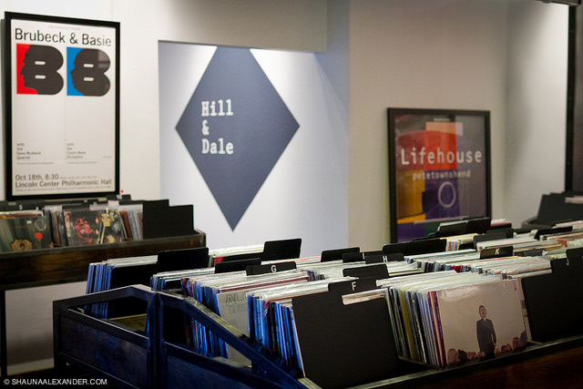
We named Hill & Dale after the vertical grooves in the phonograph cylinder, an ancestor of the vinyl record, developed just up the street in Washington, D.C. from where Rob’s store would open.
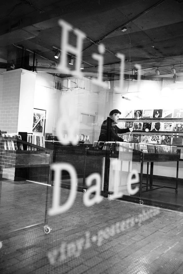
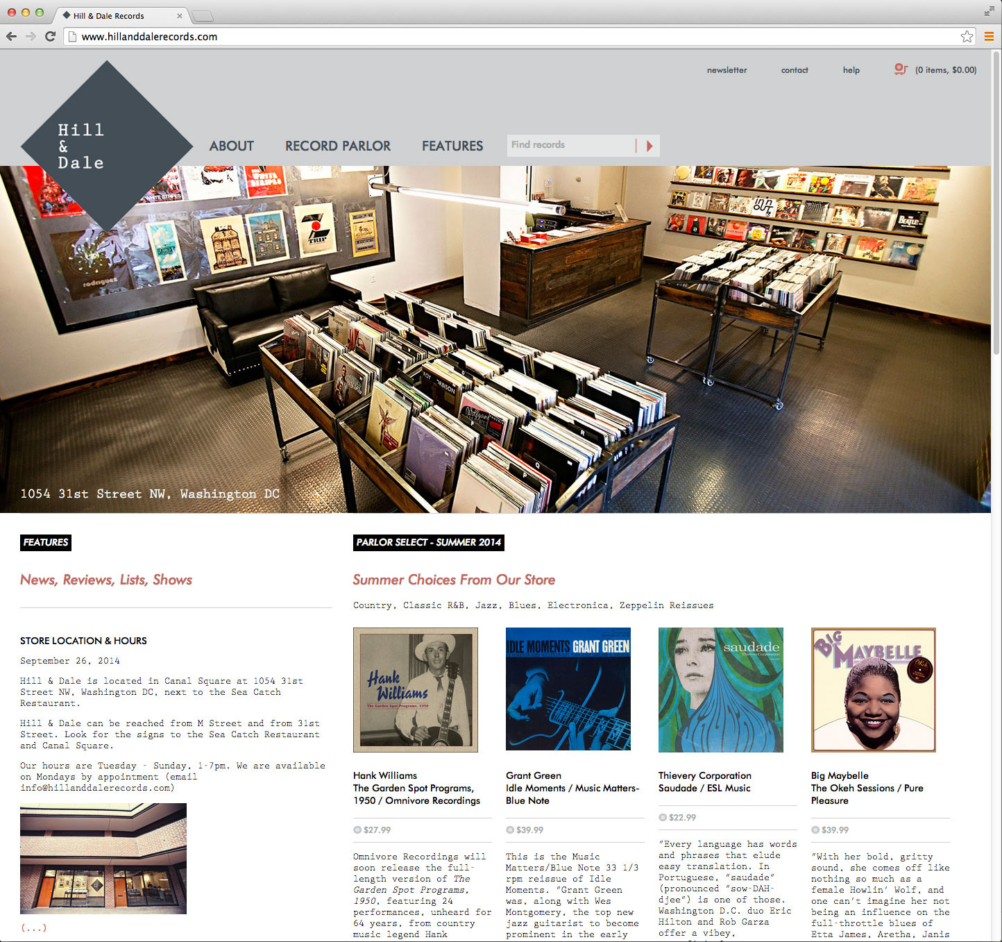
Visually, we started with the square shape of a record sleeve. Simply rotating the square 45° gave us hill on top, dale on bottom, and echoed the diamond shape of the city. The serif typeface Prestige 12 Pitch gave us a tactile feel and a beautiful ampersand as the centerpiece of the name.
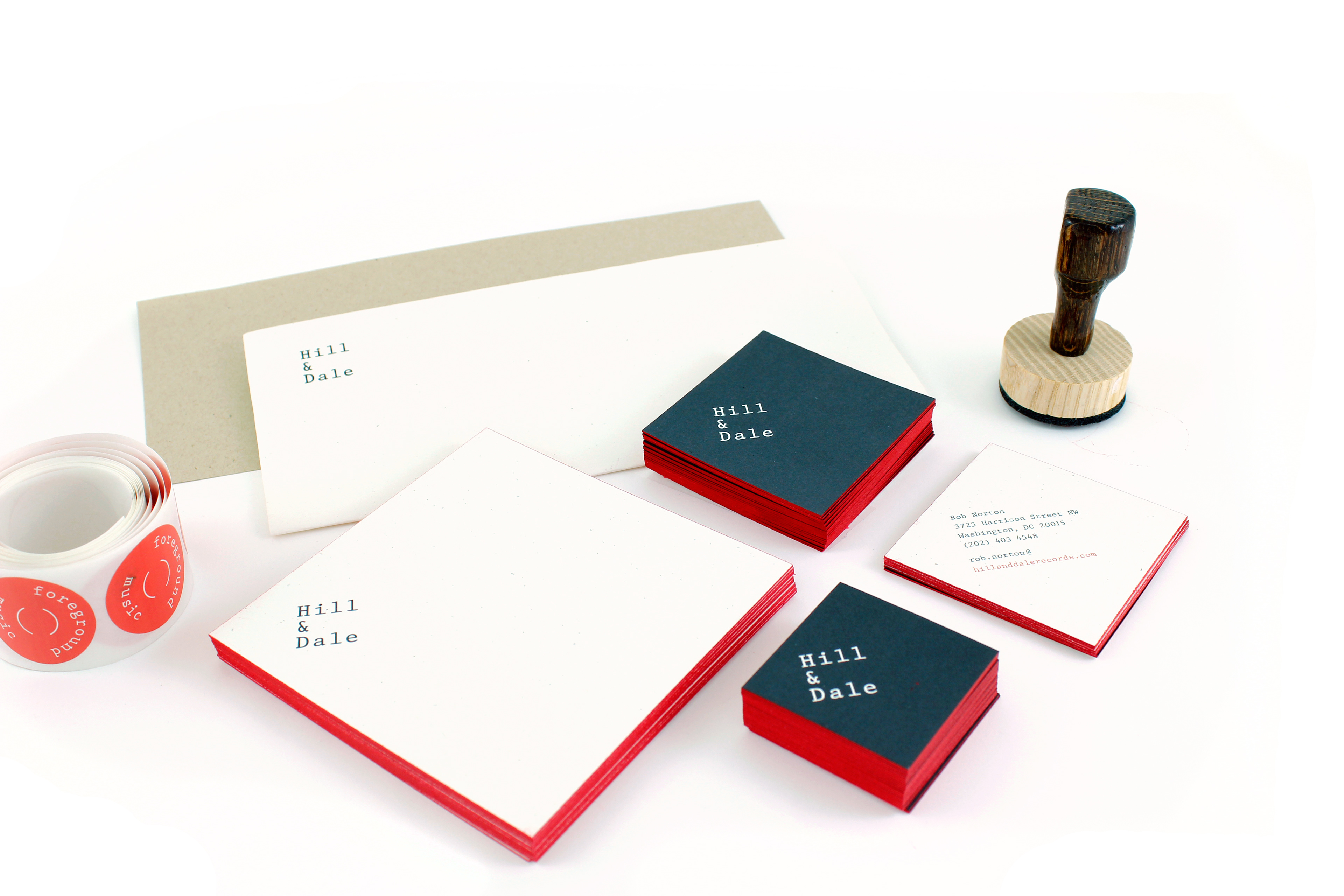
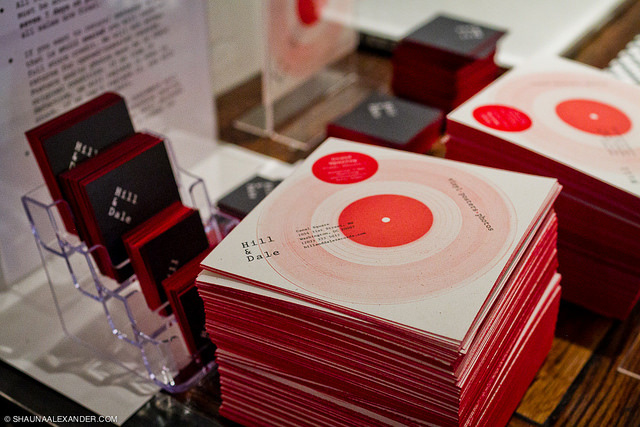
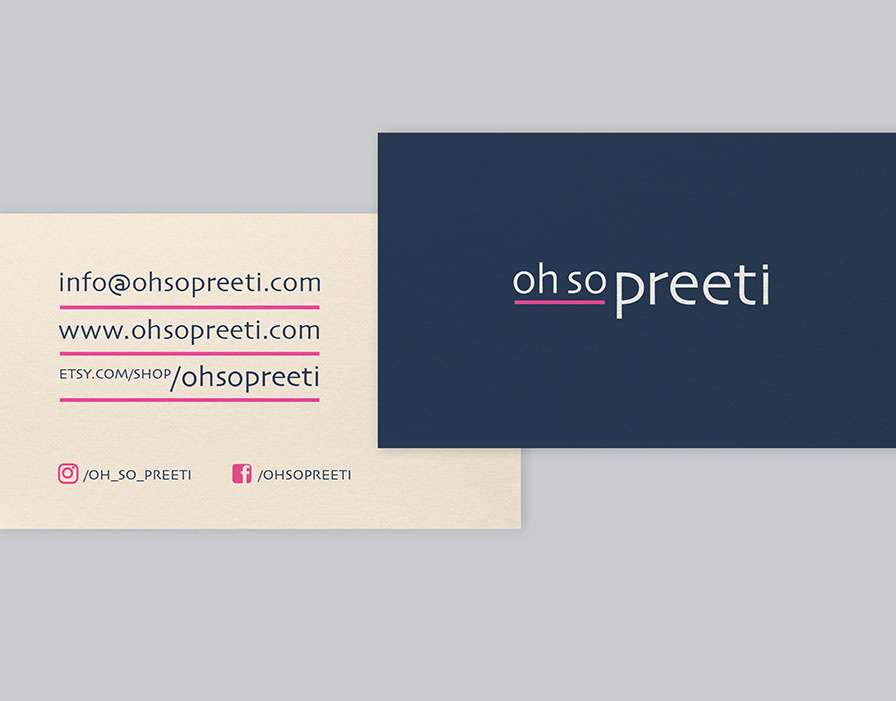
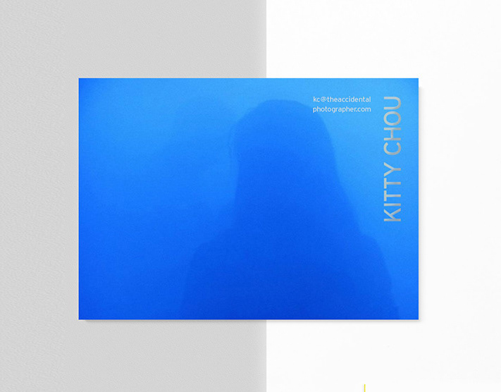
stationery
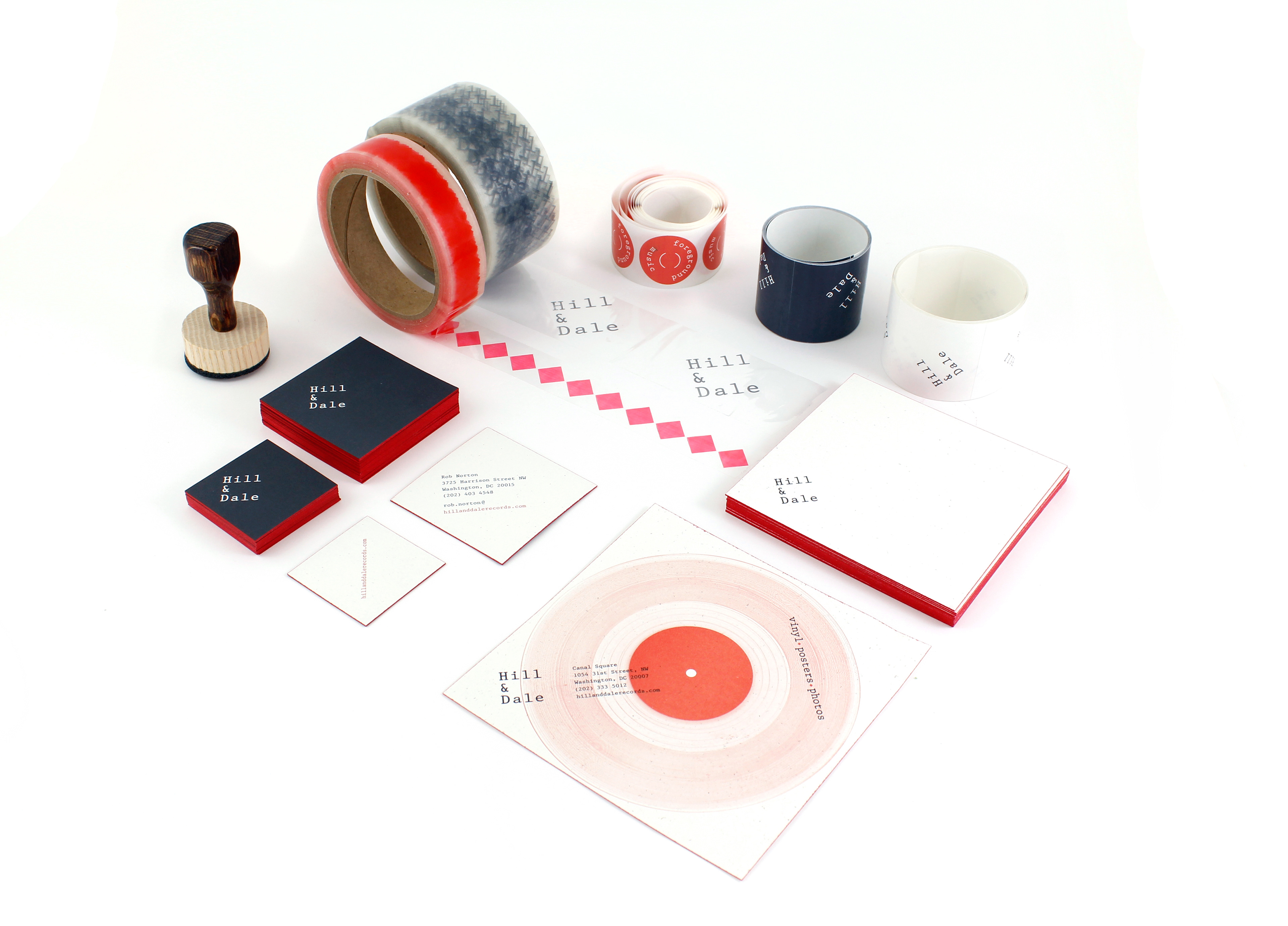
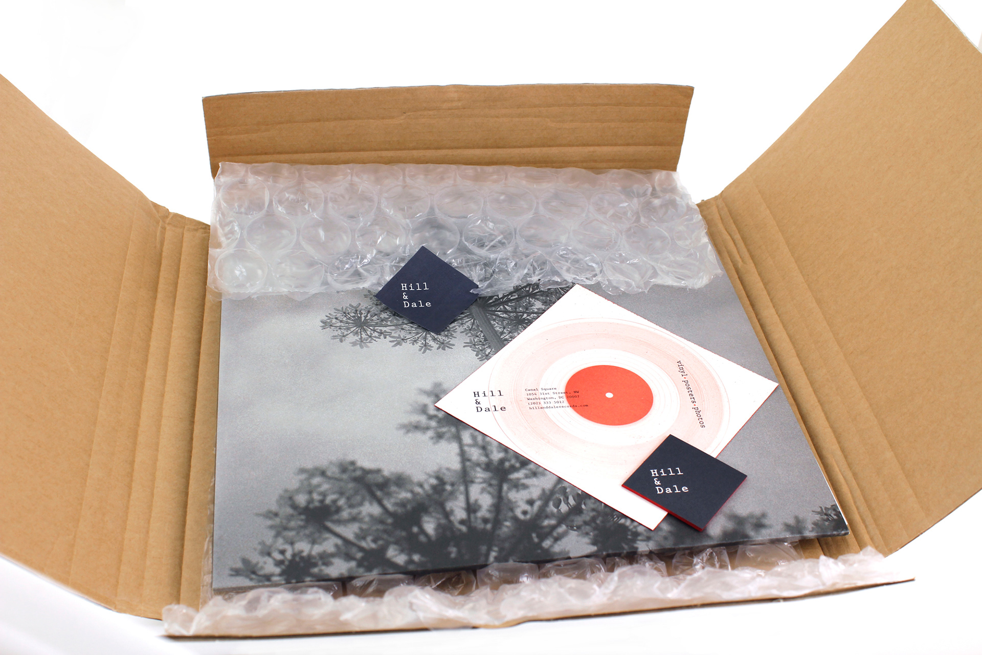
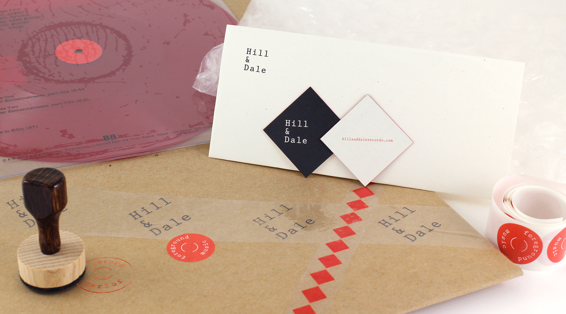
stationery and packaging material
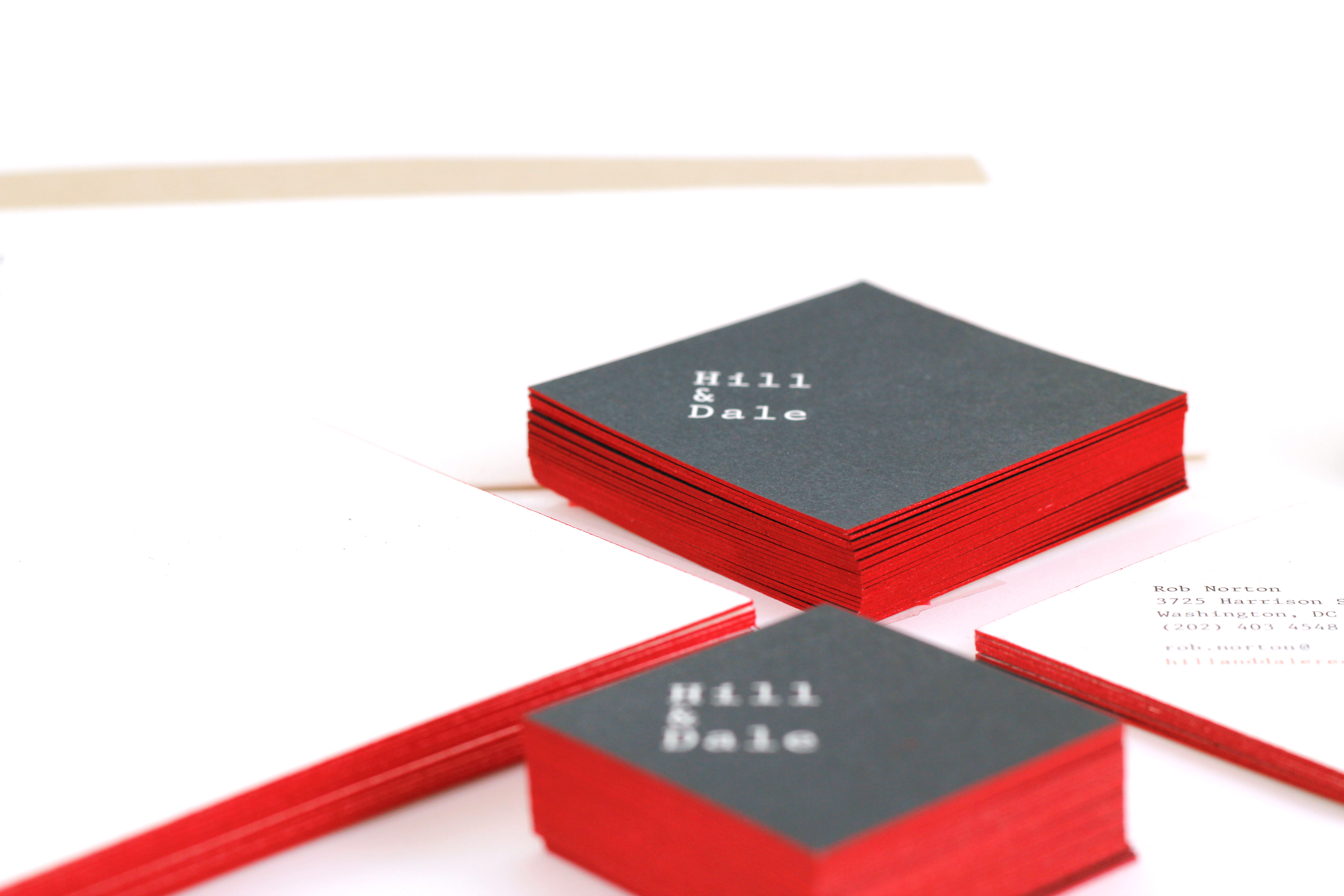
detail
record packaging

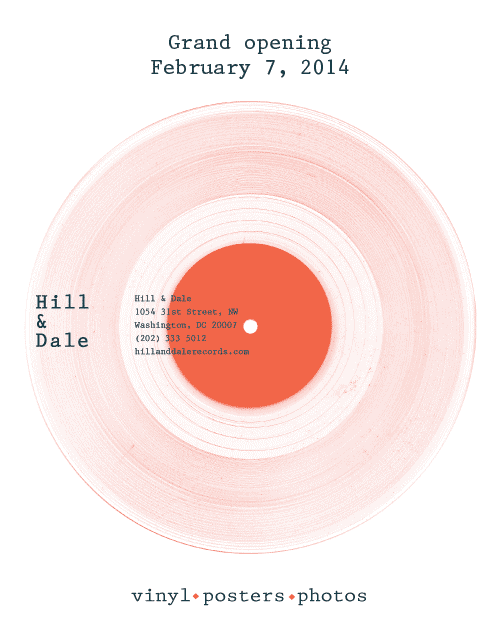
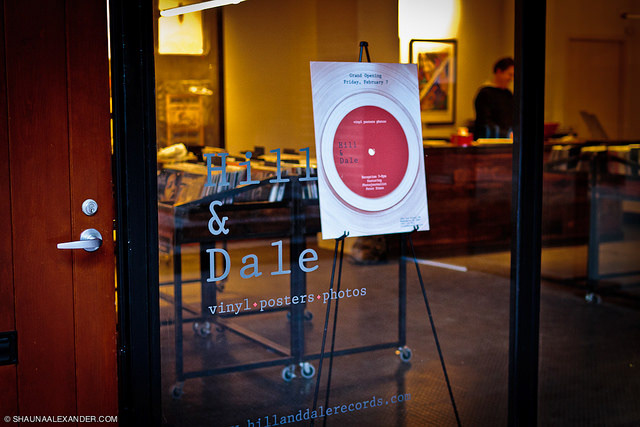
opening invite, emailer
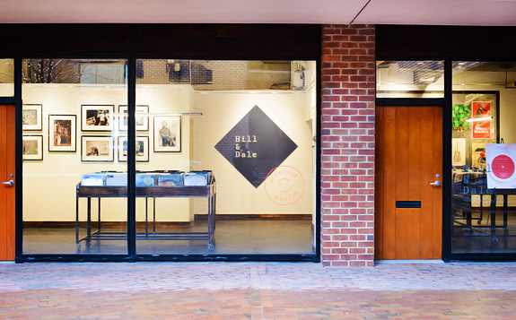
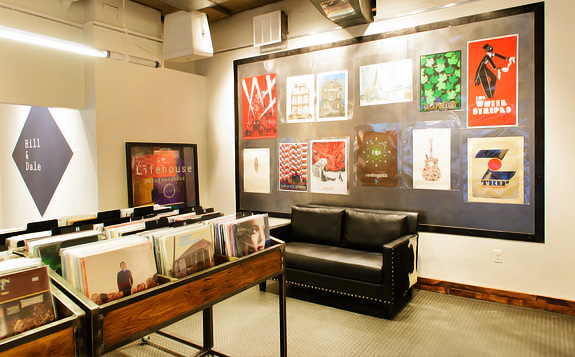
store impressions