WEDI has evolved from its modest beginnings into a mature, professional organization that is recognized throughout the region for its unique and effective programming, deep ties to the community, and dynamic ability to meet unexpected challenges.
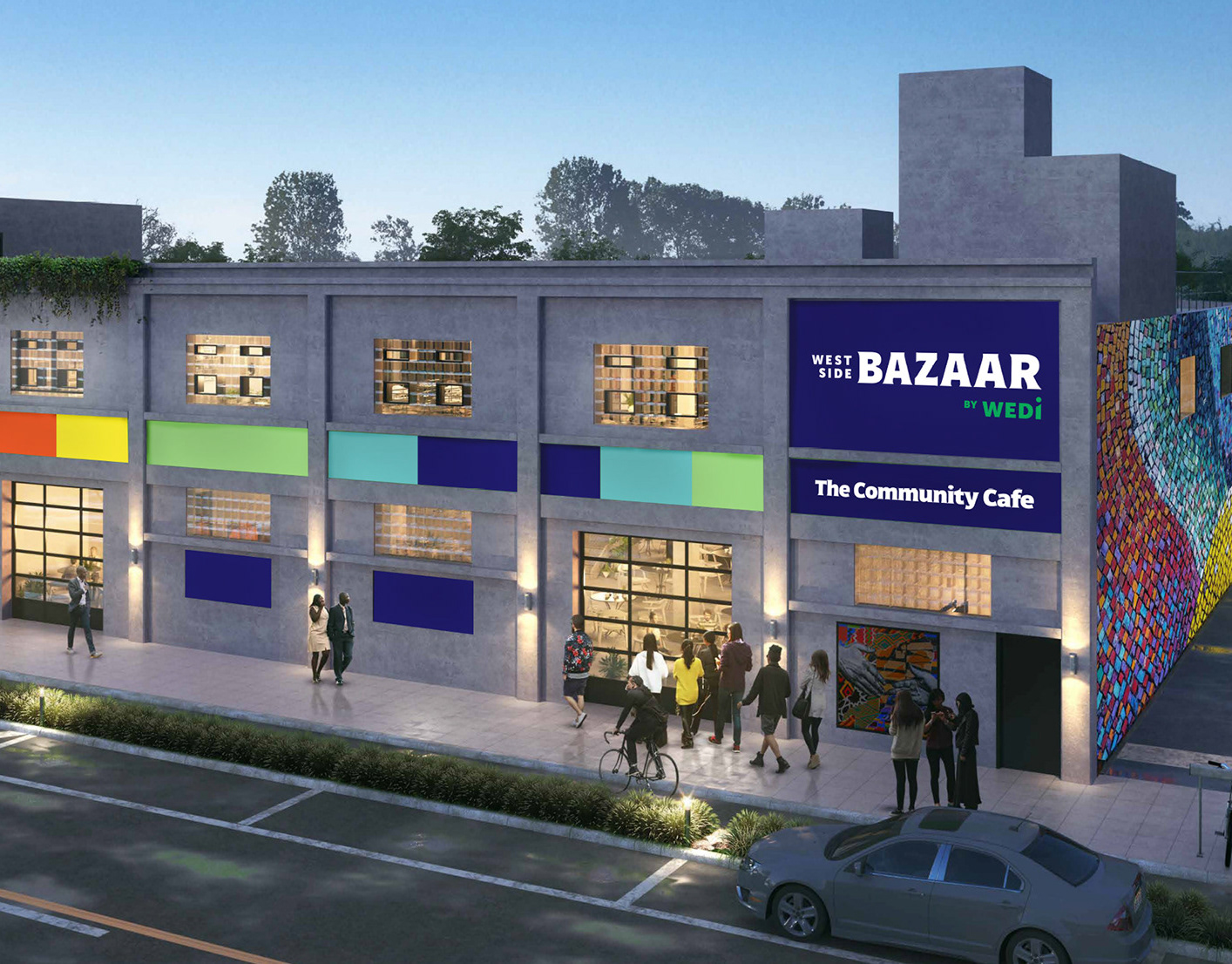
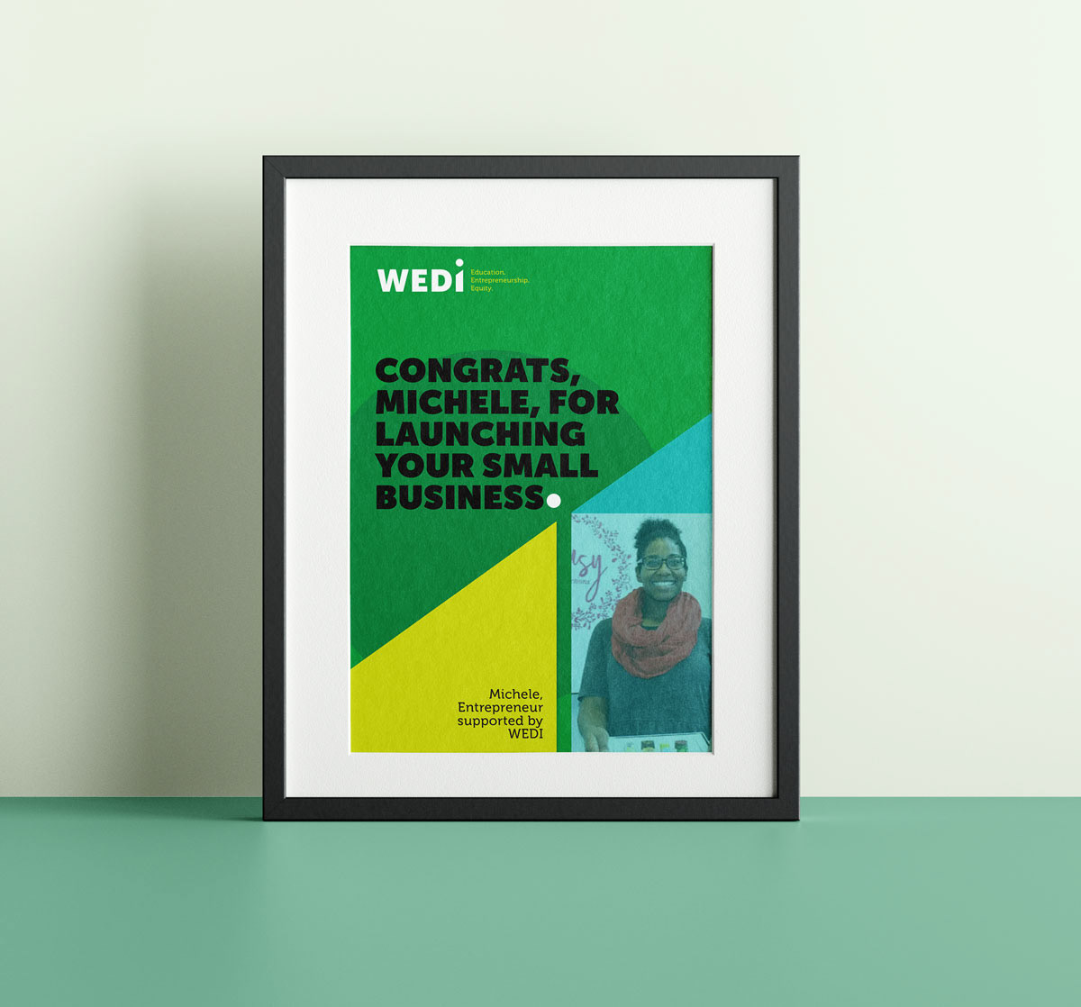
WEDI is undertaking an ambitious expansion of the West Side Bazaar and restructuring the organization to focus resources on what they do best: supporting underserved students and entrepreneurs in Western New York to succeed and thrive.
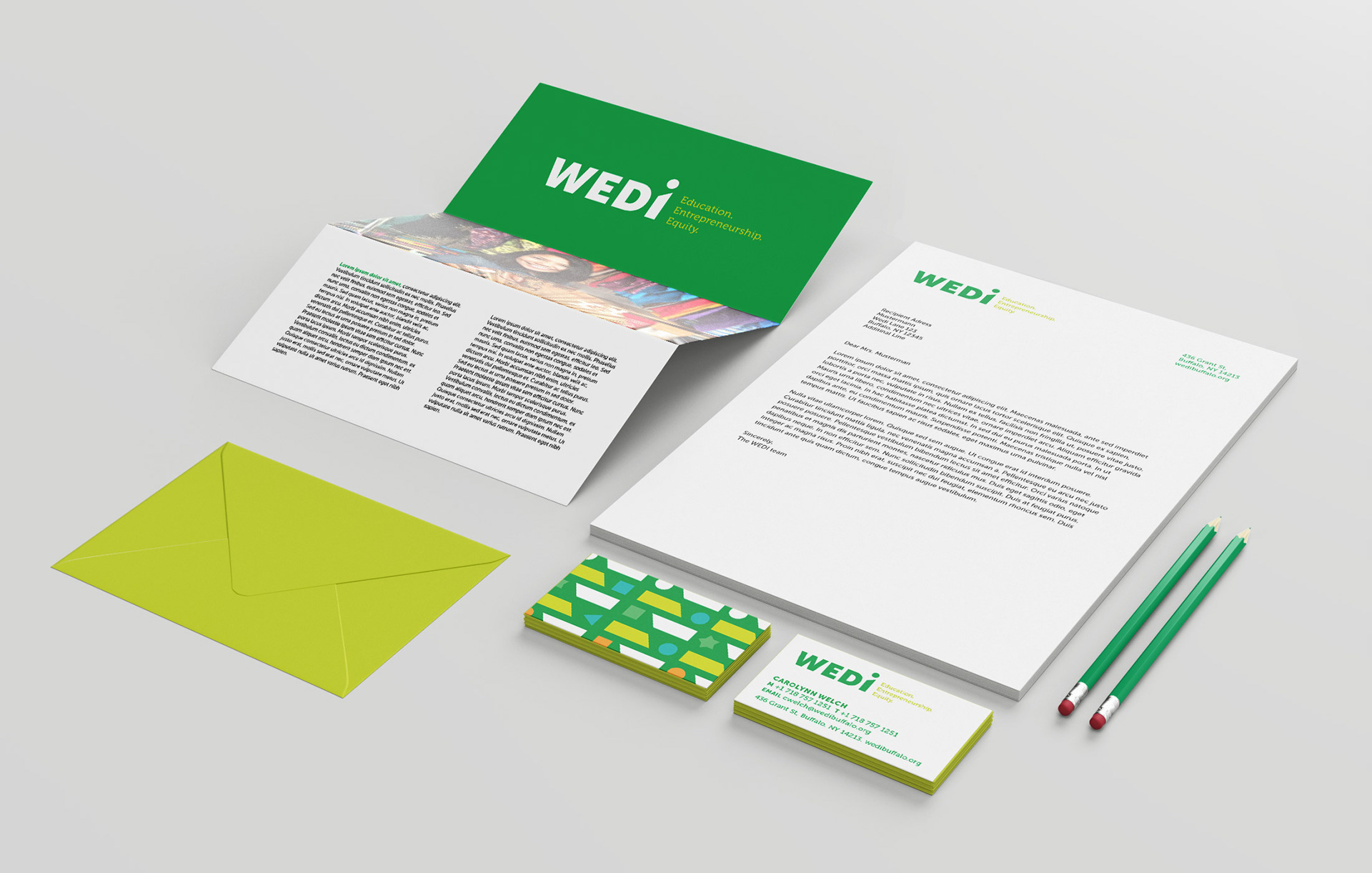
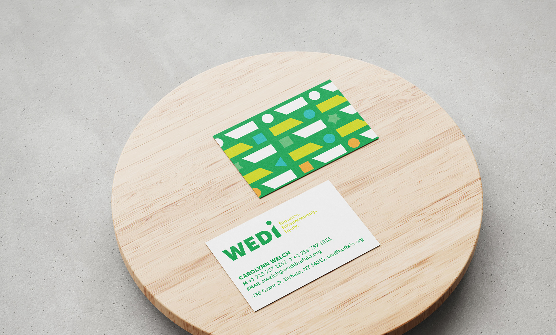
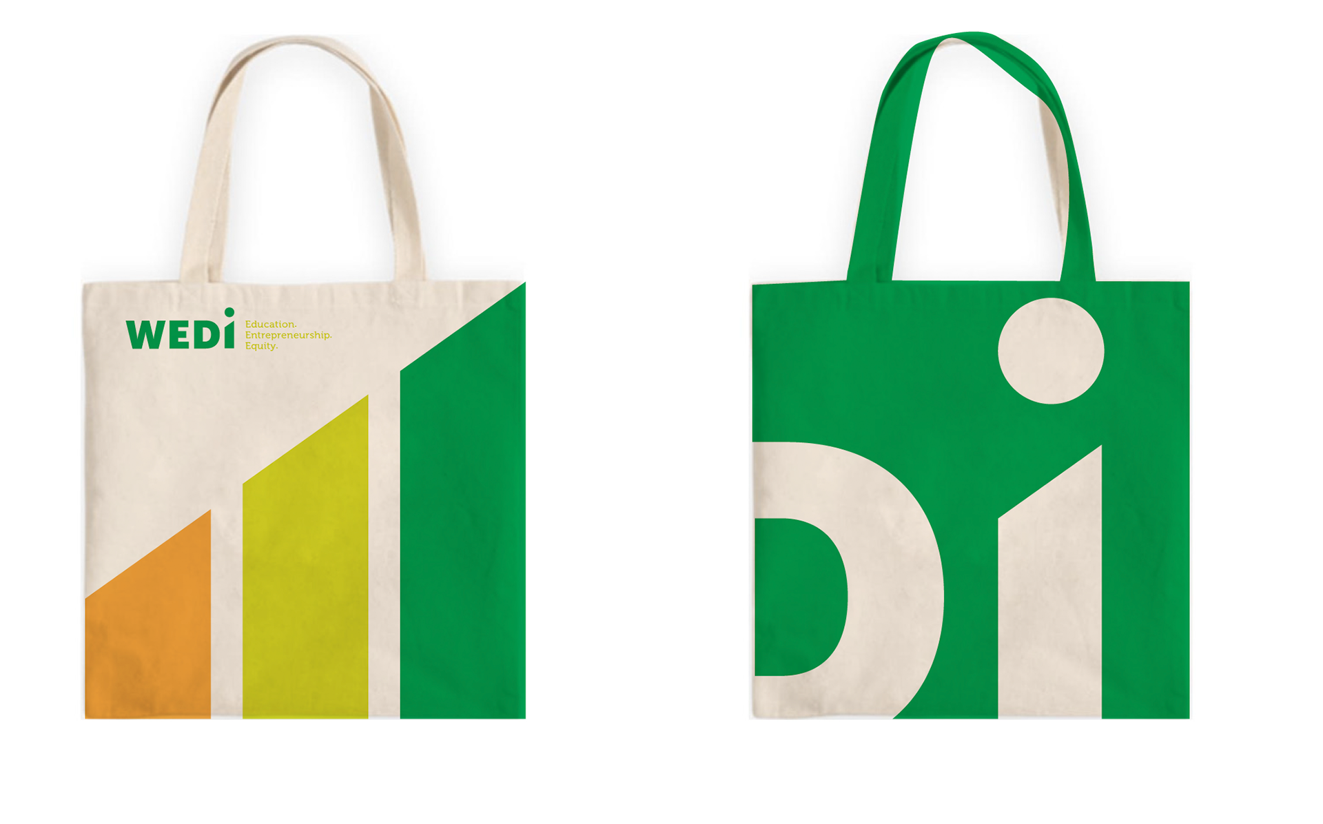
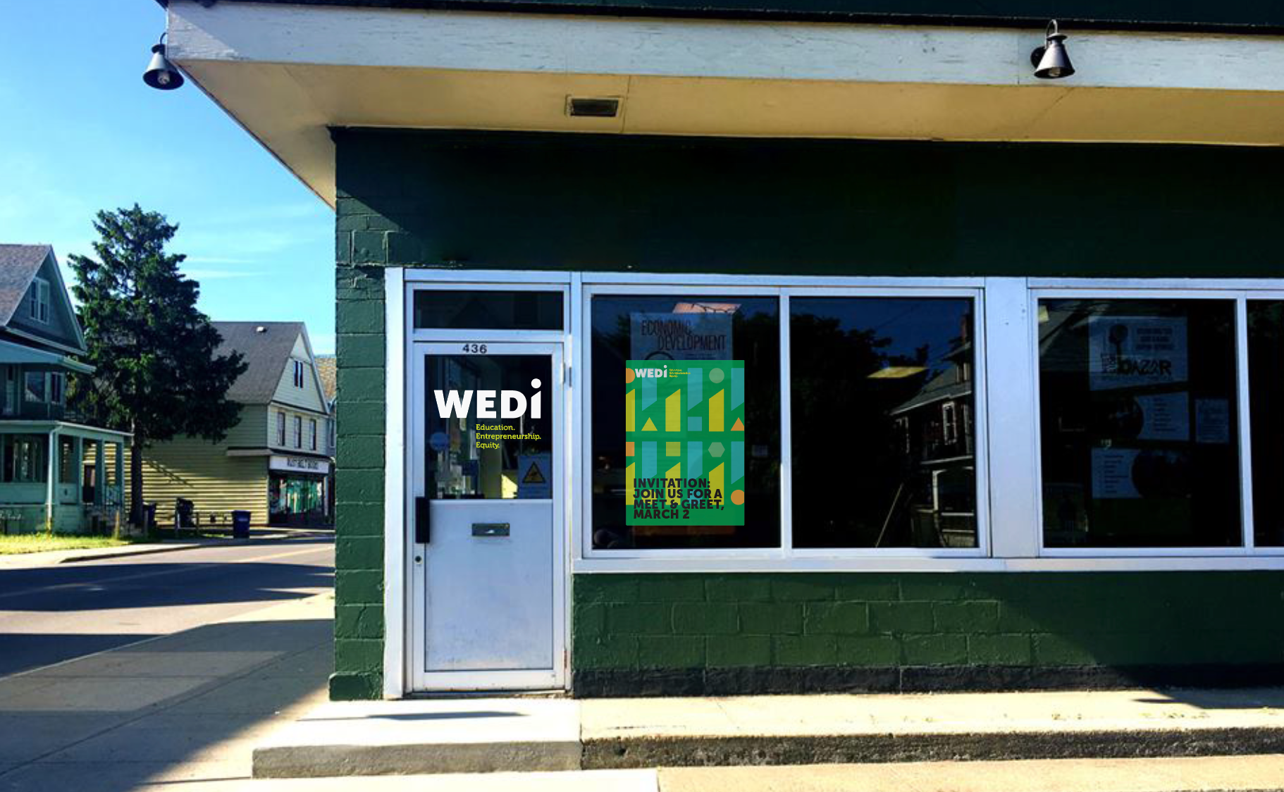
WEDI’s refreshed logo and language reflects these qualities.
Brand strategy: Zoe Behan

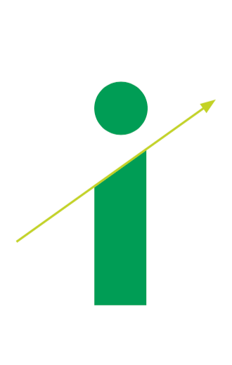
An upward movement, as incorporated in the new WEDI “i,” is a commonly understood visual gesture for growth, progress and success. The round dot—instead of the typeface's square one—over the “i” gives the base a personal, friendly, “human” character.
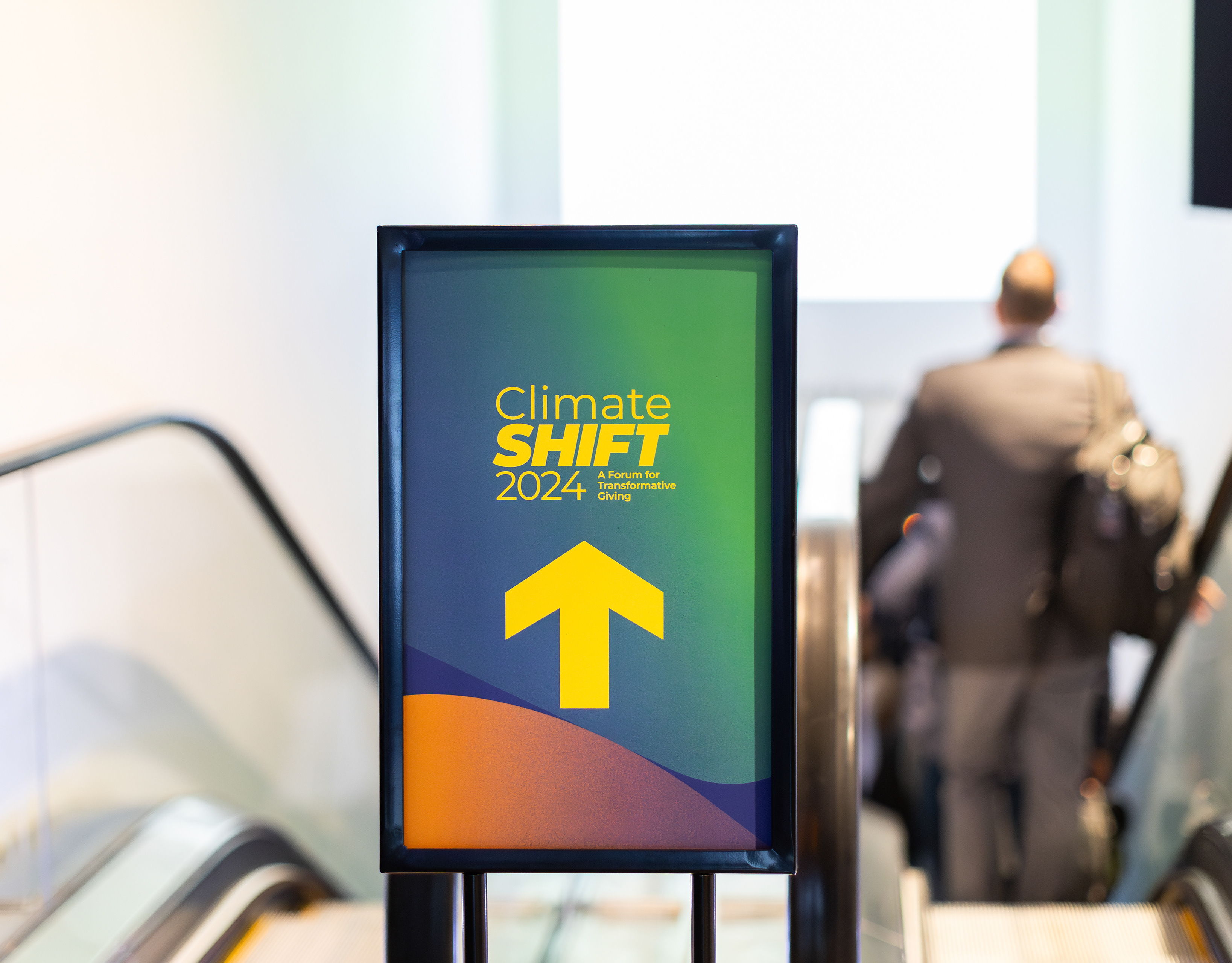
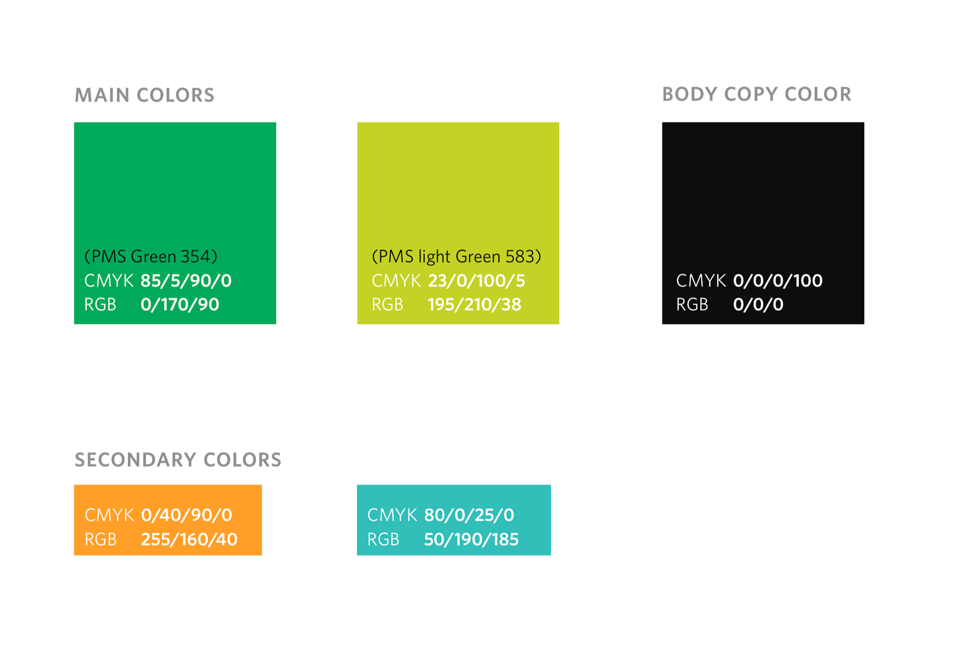
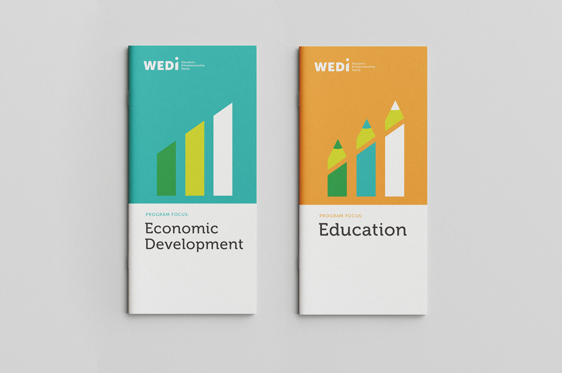
We updated WEDI's main color to a green that's at once cheerful and positive, and bold, confident and mature. We also extended WEDI's palette to include colors that represent our two focus areas: Economic Development and Education.

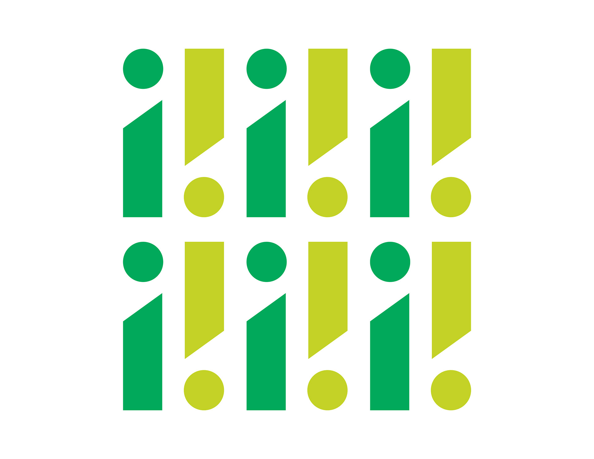
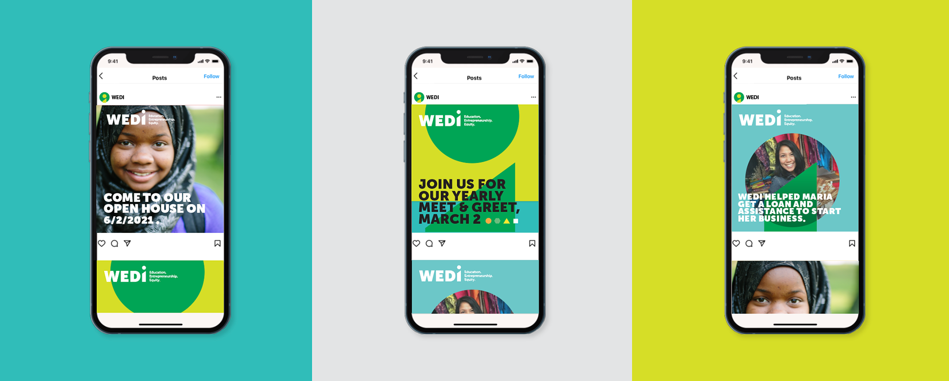
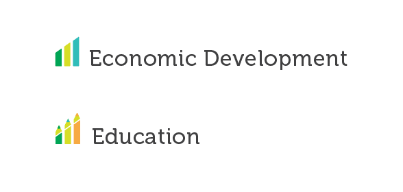
Icons for Economic Development and Education echo the logo’s upward movement. The clusters of three express the concepts of community and collaboration.
WEDI website to come!